
A lot of you are using Fanpage Karma on a daily basis. And one of the most important things when using something regularly is usability. And every so often the little things make all the difference between good and really good usability. And one of these little things is our accumulated view for the history and benchmarking graphs.
What does “accumulated” mean?
Every week we get a couple of emails with questions about the meaning of the “accumulated” option. The answer is pretty simple, though: Instead of putting every data entry in its individual position on the y-axis, it simply gets added to the one before it. So let’s say our values are 1, 5 and 19. With the accumulated view their entries on the y-axis would be displayed as 1 (0+1), 6 (1+5) and 25 (6+19).
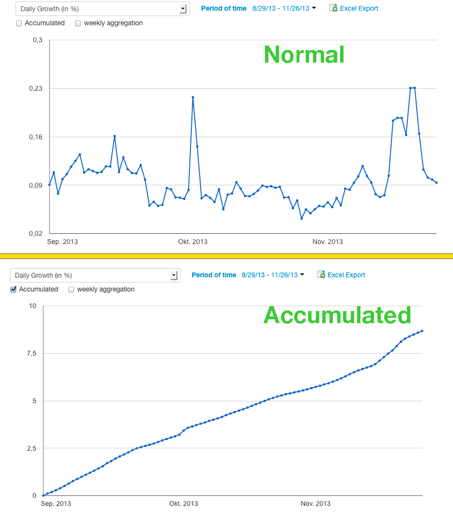
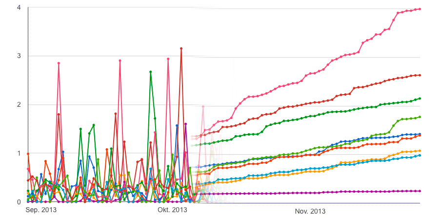
You might have noticed that, compared to the more complex “normal” display of the daily values, it’s way easier to see the development over time when it is displayed accumulated. So if you want to take a quick look at how your competitors have been doing over the last 6 months, the accumulated graph is just what you need.
It’s also tremendously useful when you want to compare the development of a couple (or a lot) of pages over time, because they all have the same starting point: 0. So instead of figuring out which zigzaggy line goes up more often, all you have to do is look at how steep the curves are.

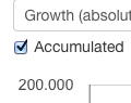
But: Of course the “values” of the curves (which you see when you move your mouse over them) are not the “real values” of that specific day, because they include all days’ values prior to that point. If you want to see the real daily values, just uncheck the little “Accumulated” box.
Little thing #2
Speaking of boxes. The little one up there is another detail we changed just recently. It allowed us to make the KPI selection, which was a long list, a lot shorter and less confusing.
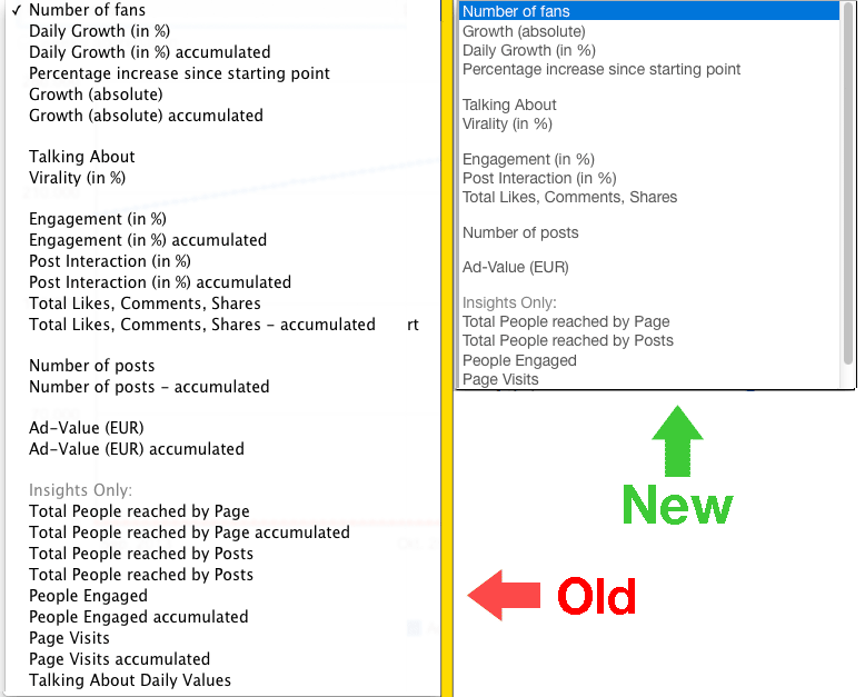
To recap: 1. For a quick overview over the development of certain KPIs the accumulated view is the best choice 2. The new checkbox allows you to find what you’re looking for faster and turns switiching between the two display-options (normal and accumulated) into a breeze.
Like we said: Sometime the little things make all the difference.
Don’t believe us? Just try it yourself. It’s free!