

“I definitely have the feeling that something has changed” or something like this can be heard, when Social Media or Community Managers talk about the development of their channels, especially if Facebook and friends made some “minor” changes to their platforms again.
But as we all know, feelings quite often give us a false idea about reality. Of course we here at Fanpage Karma are big fans of hard, reliable data and our users like to use our analytics-arsenal to see if their feeling is right, too. After all, with our great graphs and exports that takes merely a matter of minutes. But we thought it still can be easier…
One graph to compare them all
What was missing so far was an easy and fast way to compare the development of KPIs in two different periods of time. Of course you can go ahead and export a big time frame to Excel and do the comparison by hand, but let’s be honest: that’s not very comfortable.
The solution: Our new “Comparison Period” feature for all our history graphs
With only a few clicks you can easily compare the development of all our KPIs of one time period with that one of another and check if your feeling was right: Is your reach really that low compared to last year? Do your competitors really publish that much more as 3 months ago? Did your tweets really get twice the retweets than 6 months ago like your Community Manager says? No problem: Click, Click, Click, Certainty.
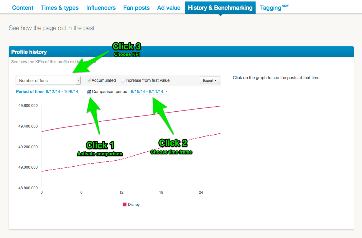
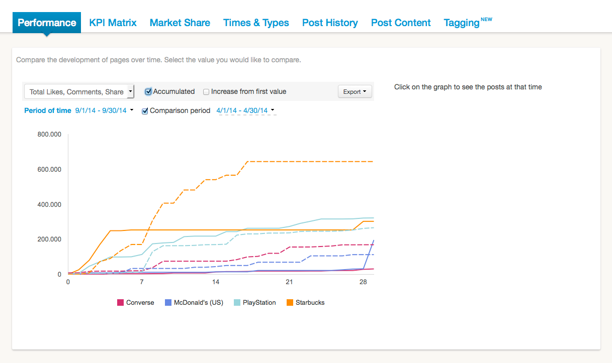
You can find the comparison under “Performance” in your benchmarking area or under “History” in the single analysis for profiles and pages. So in addition of comparing data only for one profile/page you can also check up on a complete industry or a all your competitors.
Tip: If your want to analyze tendencies or basic development, use the accumulated view, which is way clearer and does an awesome job of showing your the trend, without you having to add all the numbers yourself.
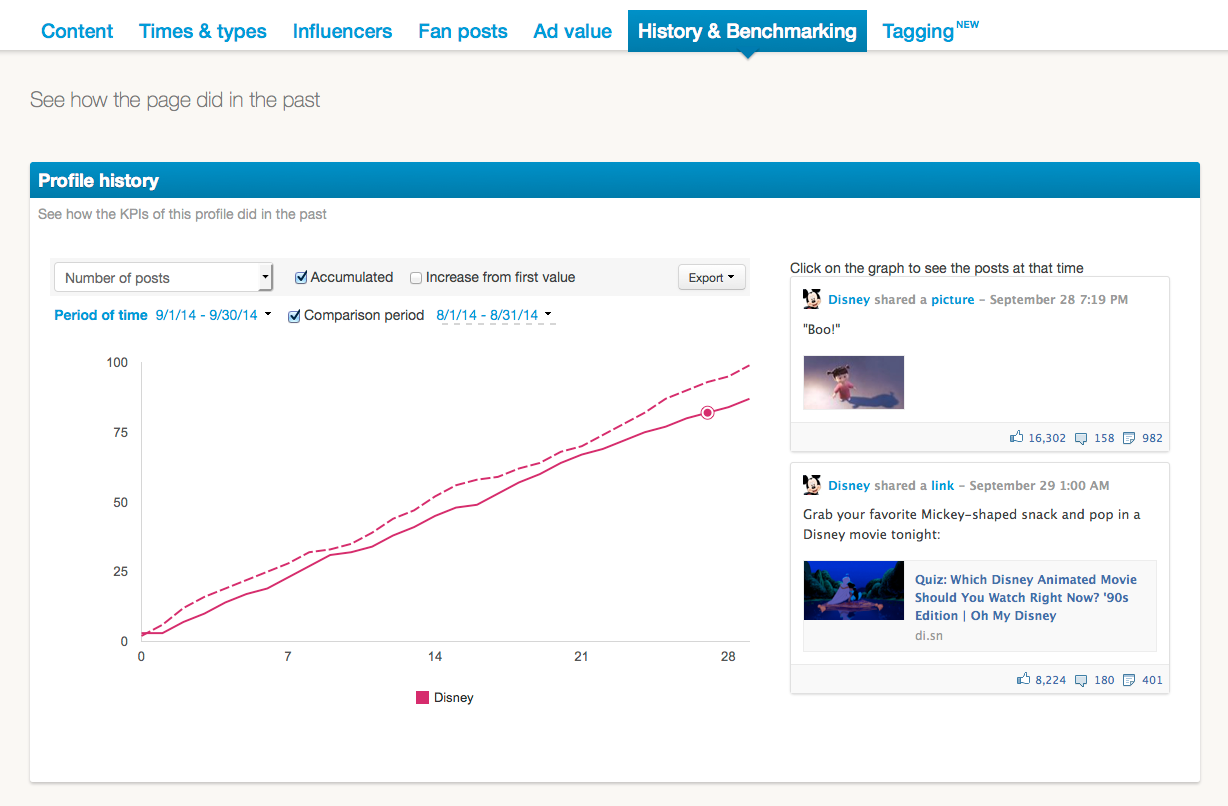
Of course the graph can be exported as a PowerPoint slide, image file or Excel sheet and used for whatever you need them for. If you want to know more about the posts of a particular day, just click on a data point in the graph and we show you the posts on the right.
It doesn’t matter what kind of feeling you experience, with Fanpage Karma it’s now easier than ever to see if it’s true. For alle KPIs and all channels: Certainty with only 3 clicks.
What about your development compared to last year? Check it now for free!